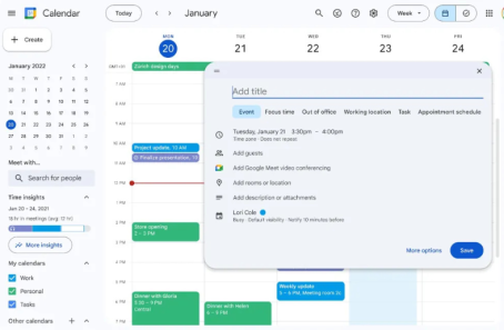
The web interface for Google Calendar is being updated to match Google’s Material Design 3 standards, and dark mode support is being added.
The company said that the change makes controls like buttons, dialogues, and sidebars more “modern and clear.” You can see that the edges of buttons and dialogue boxes have been rounded off in screenshots on the Google Workspace blog. The colour schemes have also been tweaked.
Google is also changing the Calendar UI’s buttons and fonts to make them easier to read.
For me, the best thing about this change is that it now works in dark mode. You can choose between Device Default, Light mode, and Dark mode.
Also Read: Google Changes the Person in Charge of Search and Ads
Google also said that these changes to the style will also be made to the task view list. In the next few weeks, the fix should be free to everyone.
What do you say about this story? Visit Parhlo World For more.


